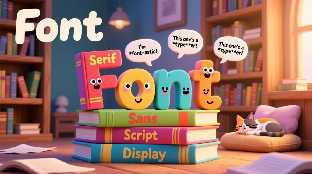
Are you ready to laugh out loud at some seriously clever font humor? Whether you’re a designer, writer, or just someone who appreciates typography, this mega collection of 390+ font puns will have you giggling like Comic Sans at a party. 🎉 Let’s dive in!
1. Classic Font Puns 🖋️
- Why did the font break up with the text? It needed more space! 🖤
- I asked the font if it was feeling bold today… it said “Absolutely!” 💪
- Fonts hate parties… they can’t handle the Kerning crowd. 🕺
- Comic Sans walks into a bar… the bartender says, “We don’t serve your type here.” 😬
- Helvetica tried stand-up comedy but failed… it just didn’t have enough character. 😂
- Fonts are like relationships: if it’s not aligned, it’s not working. ❤️
- The font wanted a promotion… it aimed to be Bold Italic! 💼
- Times New Roman never lies… it’s always serif-ious. 🕵️♂️
2. Serif vs Sans-Serif Showdown ⚔️
- Serif fonts never fight… they just add a little flair to the drama. 🎭
- Sans-Serif is too chill… it always goes with the flow. 🌊
- Why did the designer choose Sans-Serif? Less drama, more clean lines. ✨
- Serif fonts love literature… they can’t resist a good novel pun. 📚
- Sans-Serif tried karaoke… it only sang the high notes. 🎤
- Serif fonts are the oldest friends… they have a lot of history. ⏳
- Sans-Serif fonts hate clutter… they always keep it minimal. 🧹
- When fonts argue, Serif adds drama, Sans-Serif keeps it simple. 😎
3. Bold Moves 💪
- Why did the font go to the gym? To get bold. 🏋️♂️
- Bold fonts are like superheroes… they stand out in any text. 🦸♀️
- Italic whispered to Bold, “You’re so strong!” 😏
- Fonts with confidence don’t need outlines… they just go bold. 🖤
- Bold fonts never play hide and seek… everyone notices them. 👀
- Why did the font blush? Because it went bold in public. 😳
- Bold and Italic walked into a club… the font DJ said, “You guys are on fire!” 🔥
- Every font wants to be bold sometimes… it’s the ultimate statement. 💬
4. Italic Humor ✨
- Italic fonts are always running… they’re leaning forward. 🏃♂️
- Why did Italic get in trouble? It was slanting the truth. 😅
- Italic fonts love speed… everything they write looks fast. ⚡
- Italics whispered secrets to Bold… “Don’t tell anyone!” 🤫
- Fonts go to therapy… Italic always leans into their emotions. 🛋️
- Italic tried to impress Serif… it added a little twist. 🌀
- Why do Italics make bad drivers? Too many curves. 🚗
- Italic fonts are mysterious… everything they write has a hidden meaning. 🔍
5. Puns About Comic Sans 😂
- Comic Sans walked into a meeting… everyone groaned. 😬
- Why is Comic Sans always happy? It doesn’t take life serif-iously. 😎
- Comic Sans wanted to be a rapper… it just needed a better font beat. 🎧
- Comic Sans broke up with Times New Roman… too serif-ious. 💔
- Why is Comic Sans afraid of Photoshop? It doesn’t want to get stretched. 😳
- Comic Sans tried yoga… it was all flexible. 🧘♂️
- Fonts at parties: Comic Sans is the clown of the group. 🤡
- Comic Sans doesn’t do drama… it’s just here for the laughs. 😂
6. Typography Terms Pun-tastic 📝
- Kerning: the distance between letters… or how fonts personal space! 🧍♂️🧍♀️
- Leading: the line spacing… it’s how fonts breathe. 🌬️
- Tracking: fonts in formation… like soldiers marching. 🪖
- Baseline: where fonts stand… never off track. 🏁
- Ascender: letters that reach high… they aim for the stars. ⭐
- Descender: letters that dip low… always hanging out. 🪂
- Ligature: fonts that bond together. ❤️
- Swash: fancy fonts that just want to show off. 💃
7. Punny Font Names 🎨
- Why did Garamond feel fancy? It always dresses well. 👔
- Futura wanted to travel… always looking forward. 🛫
- Baskerville is the wise font… it has a lot of history. 📜
- Courier always delivers messages… pun-intended. 📦
- Impact wanted attention… mission accomplished. 💥
- Verdana is everywhere… talk about ubiquitous humor! 🌍
- Roboto loves tech… it’s always programmed to joke. 🤖
- Palatino is classy… nothing rustic about it. 🏛️
8. Digital Design Humor 💻
- Why did the font quit Instagram? Too many filters. 📸
- Fonts in Photoshop always feel layered. 🖼️
- Designers love puns… they’re the font-tastic humorists. 😎
- Vector fonts are so smooth… they never get pixelated. ✨
- Raster fonts are complicated… they have too many bits. 🖥️
- Why did the font go viral? It had a type-face for memes. 🤣
- Fonts love apps… they always app-reciate attention. 📱
- Design meetings: fonts silently judge bad kerning. 👀
9. Punny Headlines 📰
- “Font Escapes from Serif Jail, Goes Sans Notice.” 🏃♂️
- “Bold Font Declares Independence, Leaves Italic Behind.” 🇺🇸
- “Comic Sans Found Laughing in Times Square.” 😂
- “Helvetica and Arial: The Ultimate Font-Off.” ⚔️
- “Fonts Demand Better Spacing at Workplaces.” 🏢
- “Designer Shocked: Font Has Personality!” 😲
- “Serif Finally Talks… Shares Deep Lines.” 📝
- “Fonts Unite Against Bad Kerning.” ✊
10. Random Font Fun 🎉
- Fonts have feelings too… some are bold, some are shy. 😌
- Italic fonts are the secret agents of typography. 🕵️
- Some fonts just want to party… Comic Sans especially. 🎈
- Why did the font blush? It saw its reflection in the text box. 😳
- Fonts in love always find the right match. 💞
- Every font dreams of being headline material. 📰
- Fonts are like clothes… some are casual, some are formal. 👗👔
- When in doubt, just bold it out. 💪
Conclusion 🎯
There you have it — a massive collection of font puns that are guaranteed to tickle your typography-loving soul. From bold jokes to italic whispers, serif sass to Comic Sans shenanigans, there’s something here for every font fanatic. 🖋️✨ Keep these puns handy for your next design meeting, social post, or just a hearty laugh! 😄
Discover More Post
🧠 200+ Funny & Creative Ear Wax Jokes That’ll Stick With You
200+ Funny & Creative Prosecutor Jokes 😄
200+ Funny & Creative Border Crossing Jokes 🌎😂